Logo Design – Living Vitally
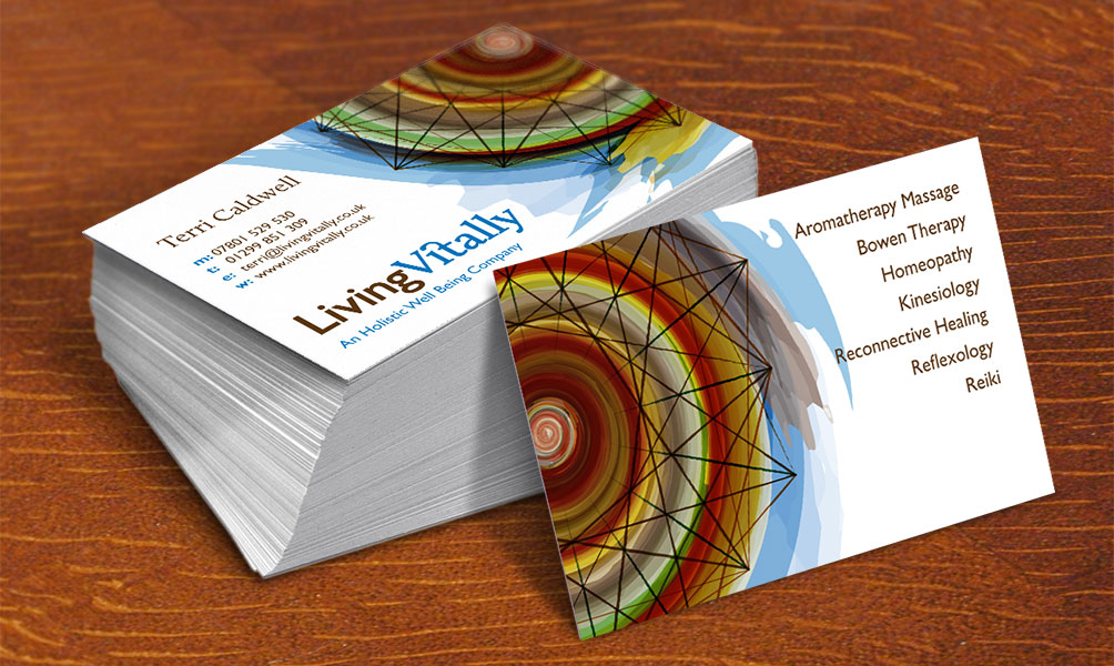
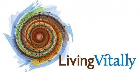
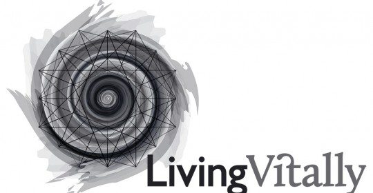
A logo design with a difference – perhaps more of an illustration than a conventional logo, the main emblem can be used at large sizes where only a portion of the entire element is displayed, the logotype that accompanies it conveys the business name in a clear and concise way. Despite being drawn in a style emulating water colours and pastels and using a complex range of colours that blend together the logo can also be produced effectively in single colour.
Working with Andrew on the development of my logo has been one of the very best experiences I have had in this field. In the brief I presented him with an idea of the theme I wished to work with and then I provided a visual representation. Andrew’s job was to turn that into something dynamic and special, and to make it work across the range of media. Andrew came back to me within 48 hours with an amazing piece of work, for the sake of exploration I asked Andrew for a couple more colour options which he willing provided. However, it was obvious that Andrew had ‘got it’ right from the beginning. Andrew has translated this into a business card, letterhead and for website use, each of which was spot on first time!
Terri Caldwell – Living Vitally
View the Living Vitally Logo Design in use on their website


